
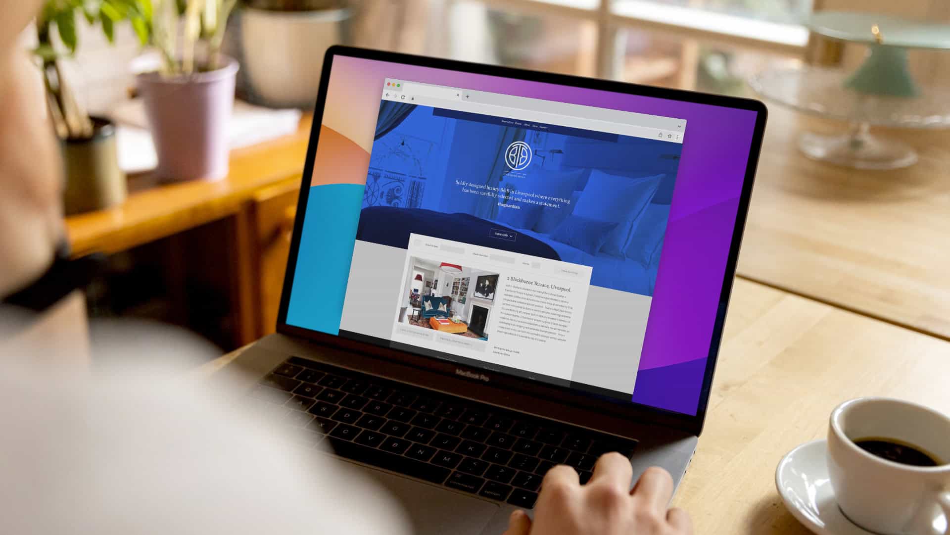
When I review a hospitality website, I look past the visuals first. That surprises people. They expect me to comment on the photography or the colours straight away. I don’t, not initially. I want to know one thing before anything else: can a guest actually do what they came here to do, and how many clicks does it take them.
Because a website isn’t usually a design problem. It’s a clarity problem. And in hospitality, clarity is directly tied to revenue in a way that a lot of other industries don’t have to think about quite so nakedly.
The Booking Journey Is the Whole Job
A guest visiting a hotel or restaurant website has usually already decided you’re a contender. They’re not browsing for fun. They want to know what a room looks like, what’s on the menu, whether you can seat six people on a Friday, and then they want to book, fast, before they get distracted and open a competitor’s site in the next tab.
Every extra click between “I’m interested” and “I’ve booked” is a chance to lose them. We always aim for the fewest possible steps between arrival on the site and the action we want the guest to take, with calls to action placed deliberately throughout, not just parked in the header and forgotten about.
A guest who can’t find your room types or can’t get to the booking engine without hunting for it won’t email to ask where it is. They’ll just book somewhere else. That’s the uncomfortable truth about hospitality websites. There’s no polite friction. There’s just a lost booking.
Mobile Isn’t an Afterthought, It’s Where Most of Your Traffic Already Is
This one still catches hospitality brands out. The majority of traffic to a restaurant or hotel website now lands on a phone, often someone deciding where to eat in the next thirty minutes, standing outside somewhere else entirely. If your site is built desktop first and mobile feels like a compressed afterthought, you’re optimising for the smaller slice of your actual audience.
That means menus that don’t need to be pinched and zoomed. Booking widgets that work with a thumb. Load times that don’t test someone’s patience while they’re stood on a street corner deciding between you and the place next door.
Does the Site Actually Feel Like Being There?
Here’s where the brand side comes back into it, because a fast, clear website that looks like a generic template with your logo dropped in still isn’t doing its job properly. We’ve reviewed hospitality websites where the photography was genuinely strong, the service in person was excellent, and the booking conversion was still low. Almost every time, the gap was between what the venue felt like and what the website communicated.
If someone walks into your restaurant or hotel and it feels nothing like the site they browsed the night before, you’ve created a small moment of doubt right at the point you most need trust. Consistency between the digital experience and the physical one isn’t a nice to have in hospitality. It’s part of what makes people believe you’re going to deliver on the rest of the evening or the stay.
What We Actually Build
At Fore Studio we build hospitality websites around three things in order: purpose, structure, then design. What is this site actually for, what do we want a guest to do, and how do we get them there in the fewest, clearest steps. The visual layer comes after that thinking is settled, not before it, because a beautiful site built on the wrong structure is still going to underperform.
We’ve done this for hotel groups, racecourses and independent restaurants across Liverpool and further afield, and the pattern holds regardless of size. The venues that convert well aren’t necessarily the ones with the biggest budget. They’re the ones where someone sat down and actually mapped the guest’s decision before a single pixel got placed.
A Website Should Reduce Effort, Not Add To It
If your site is making people work harder to book a table than they’d work at the check in desk, something’s gone wrong long before the design stage. That’s the standard I hold every hospitality website project to. Not “does it look nice”, though it should, but “does it make the decision easier for the person on the other end of the screen”.
If you’re looking at your booking numbers and suspect the website is quietly costing you more than you realise, get in touch and we’ll take an honest look at where the friction actually is.
Upgrade Your Guest Experience
If you’re ready to develop a brand or environment guests naturally want to share, we’d love to help.
Book a Consultation Call